Community Gearbox
Making co-ownership more personable and rewarding
- Timeline
- Jan–May 2023
- Role
- UX Designer & Researcher
- Platform
- iOS

Customer problem
Community Gearbox is a social inventory management platform that aims to encourage co-ownership and reduce individual consumption as a sustainable alternative to item ownership. Community Gearbox supports people and organizations to co-own and share possessions and resources amongst groups of people they know and trust. But despite great interest in the app, its current experience suffered from engagement drop-offs and usability issues.
Over a five-month Human Centered Design and Engineering (HCDE) major capstone, I along with three other designers, partnered directly with one of the startup's co-founders to answer the question: How might we improve the item-sharing process on the platform to be more personable and rewarding than just renting and borrowing?
Outcome
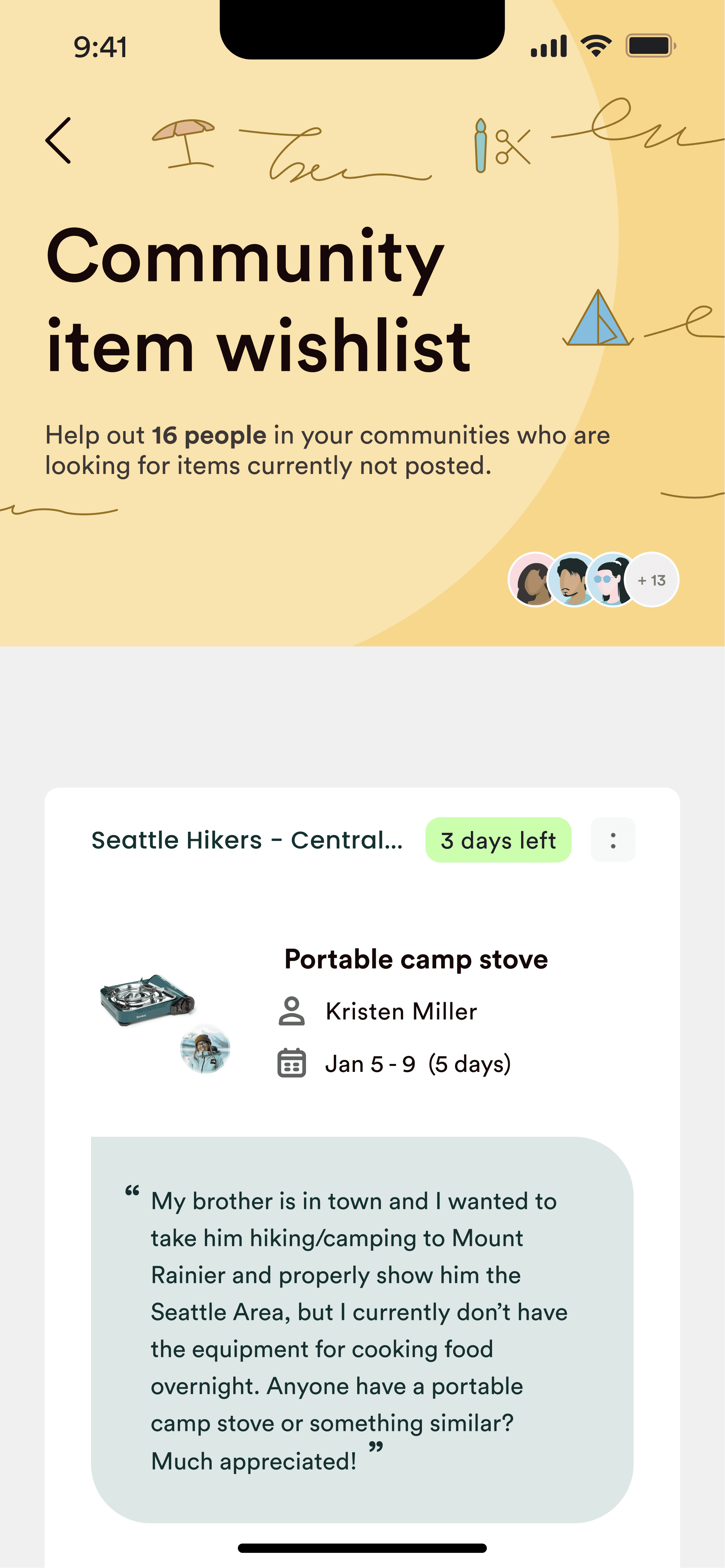
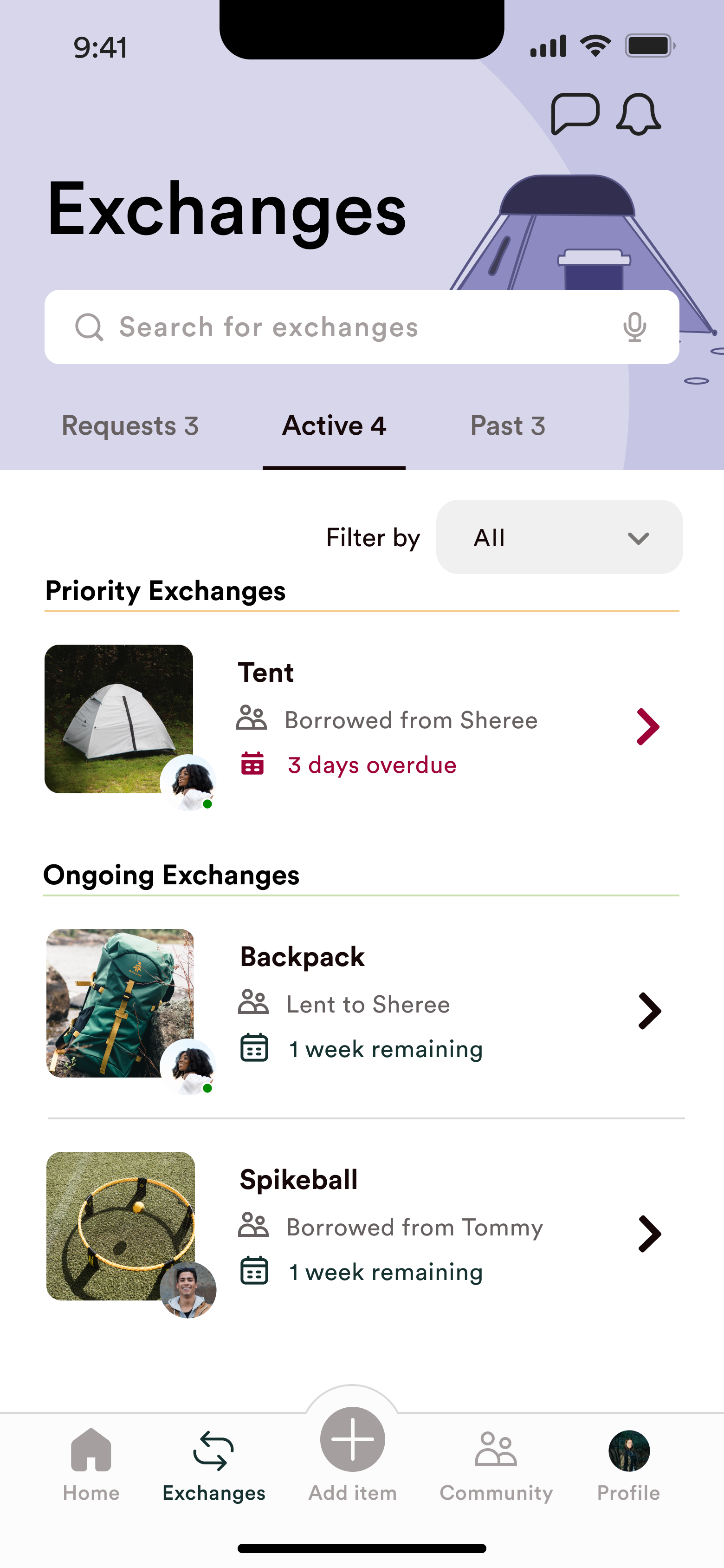
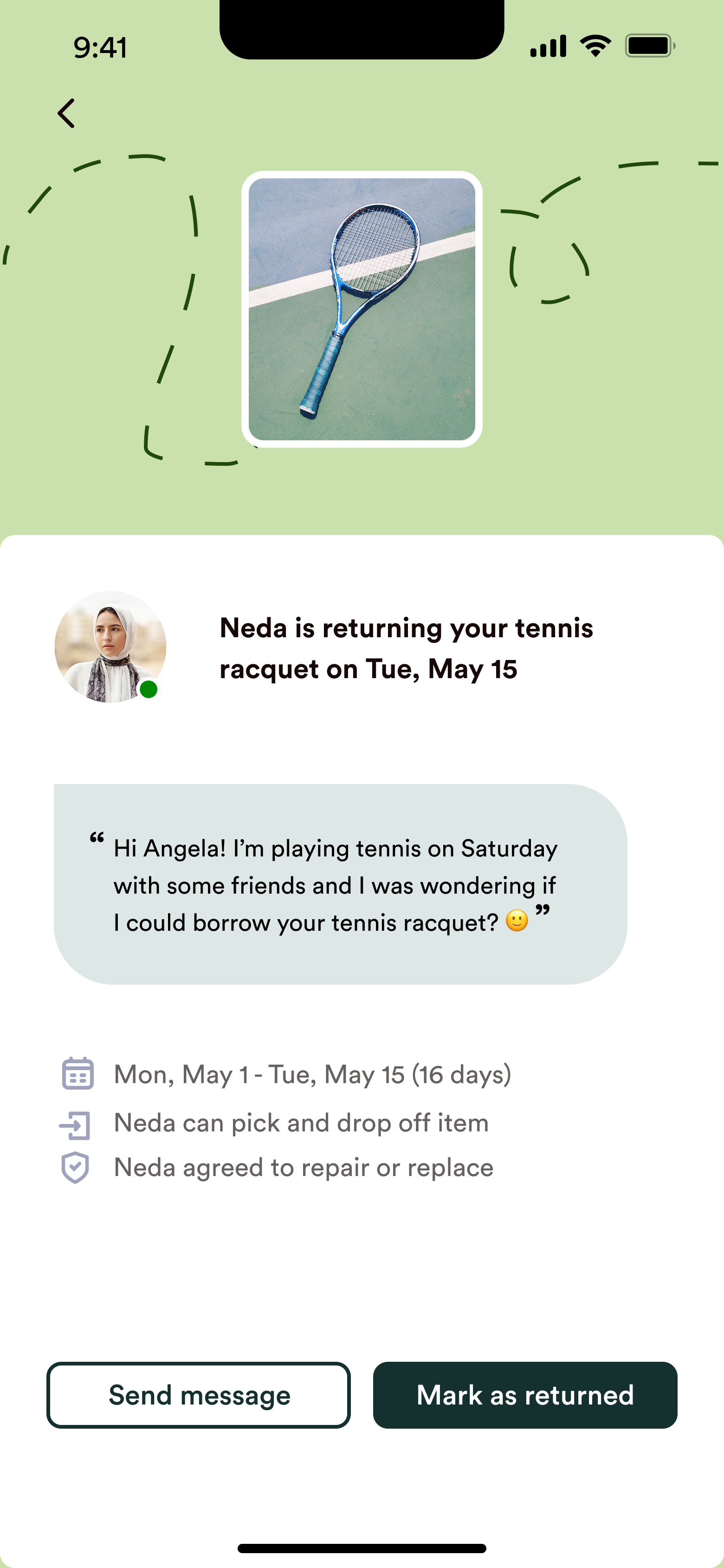
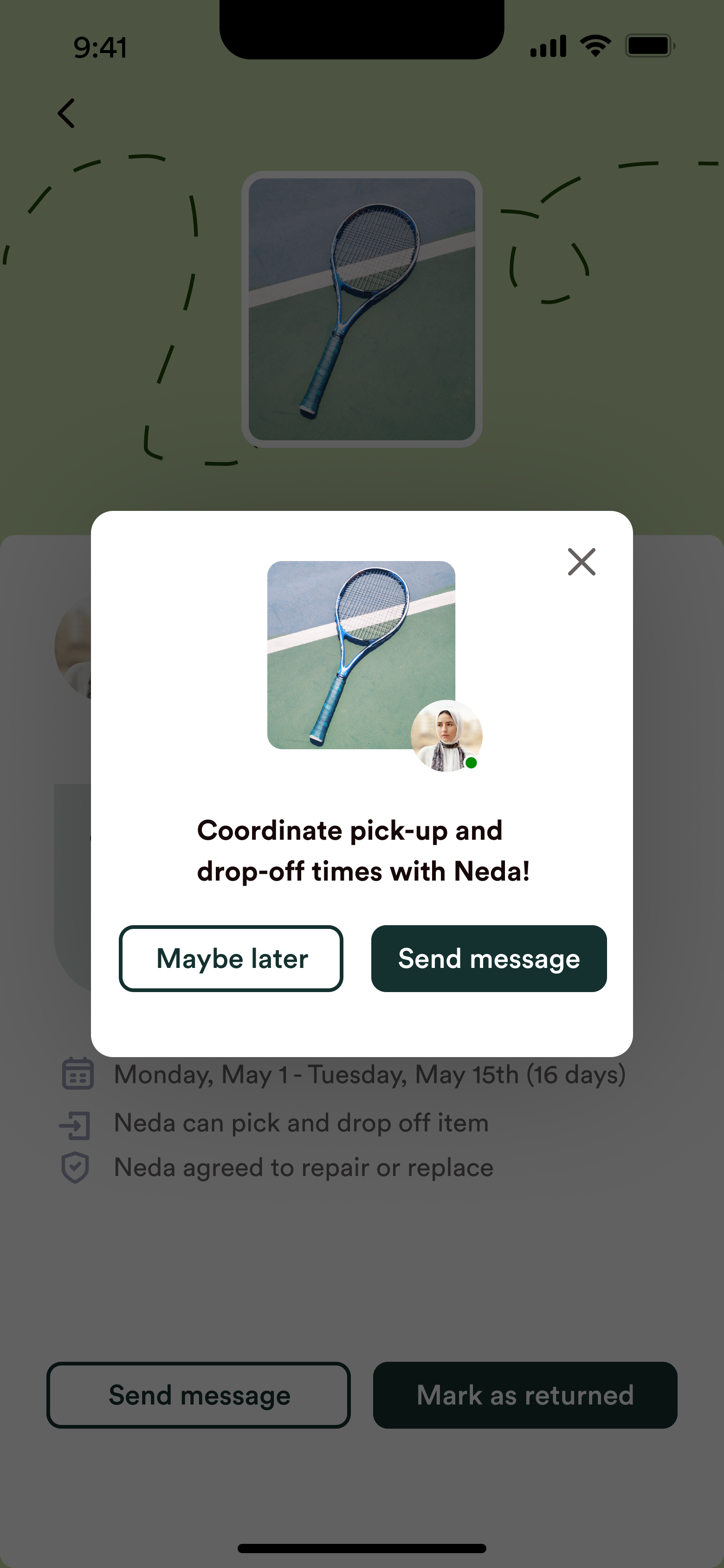
We delivered a high-fidelity, interactive prototype — along with a video walkthrough — that reframed Community Gearbox around community rather than transactions. It centered on three redesigned features drawn from our research: item wishes, a guided, more playful way to ask for things your community hasn't shared yet; track exchanges, where a search bar, filters, and clear status states let borrowers and lenders follow a loan from request to return with ease; and badges, a new reward system of virtual stickers people award each other after an exchange — making sharing feel celebratory rather than transactional.
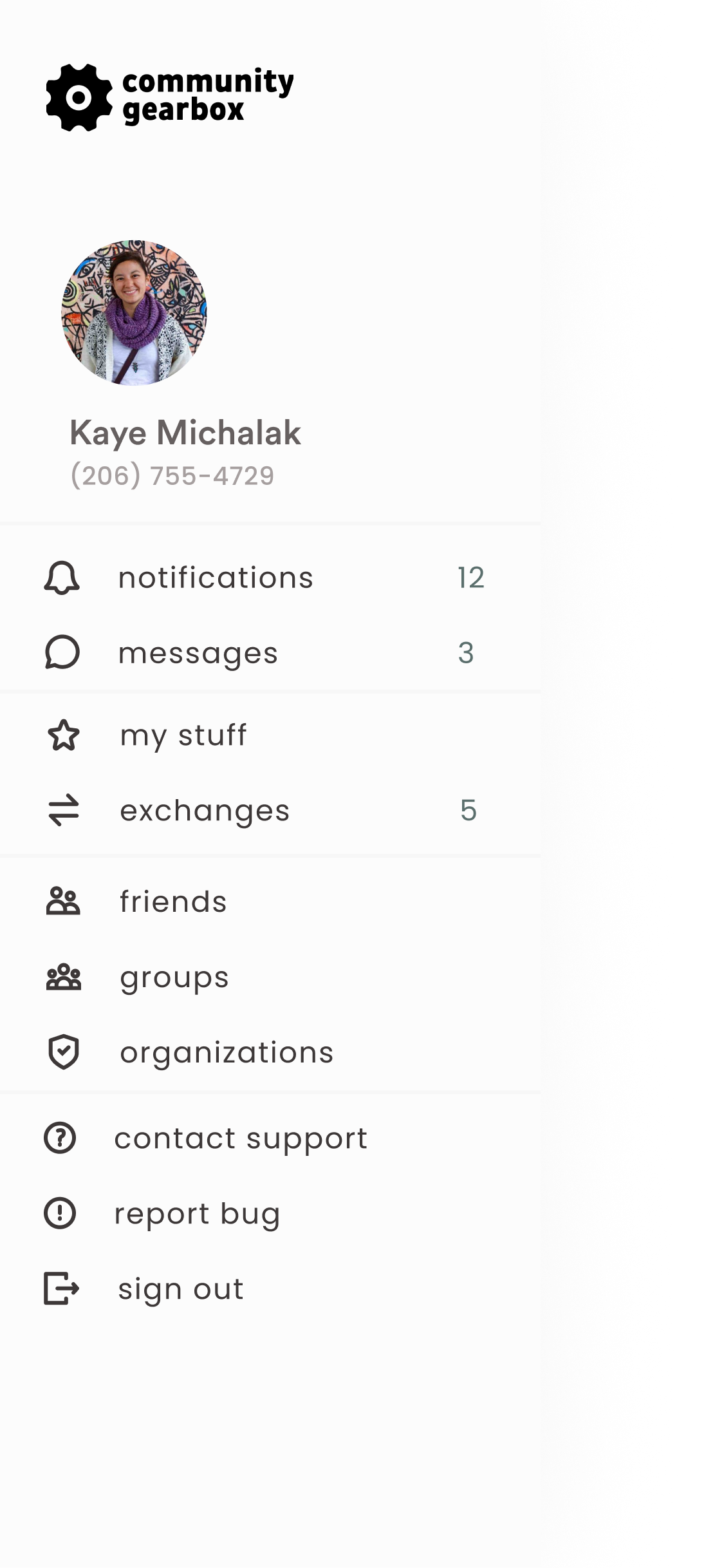
We also rebuilt the app's information architecture — replacing the split hamburger-and-bottom-bar navigation with a single bottom nav, and surfacing core content like exchanges and messages so they're far easier to reach. Alongside the prototype, the co-founder we worked with adopted our full heuristic evaluation of the app to guide fixes in the next release.

My role
I was one of four UX designer-researchers on this HCDE senior capstone, working directly with one of the startup's co-founders. We ran the research and early ideation together, then each went deep on different feature areas — I owned the item-wish requests and search experiences, and collaborated with my teammates on the Home experience, where our areas intersected. We worked closely throughout, continually aligning on shared patterns and a common visual language so each designer's core area came together as one cohesive experience.



Research
Building upon existing research, we reviewed 5 of the startup's prior, unanalyzed usability tests and 7 of their discovery interviews, then ran an additional 4 user interviews of our own. Together these three sources built our understanding of the problem space — how, why, and with whom people share and borrow; their motivations; the builders and breakers of trust; and the pain points and friction of borrowing and lending, both with and without the Community Gearbox app.
What the research told us
Key design decisions
I owned the search and item-wish-request experiences end to end, and shaped the home screen with my teammates — each decision working to make sharing feel personable and rewarding rather than transactional.
A home screen built to spark sharing
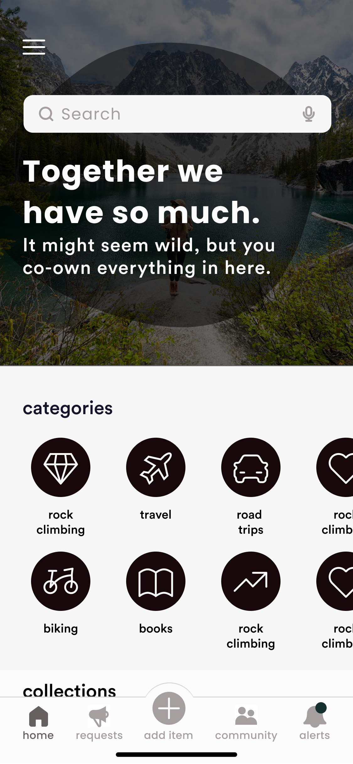
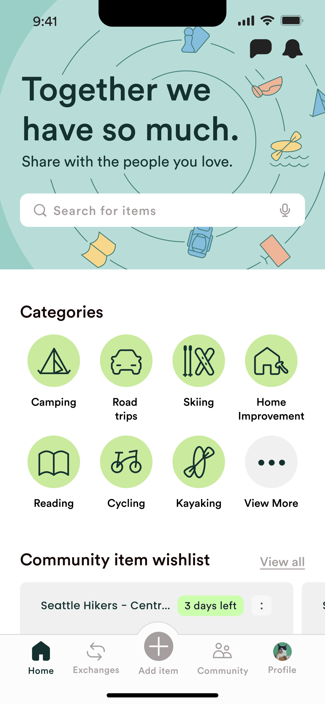
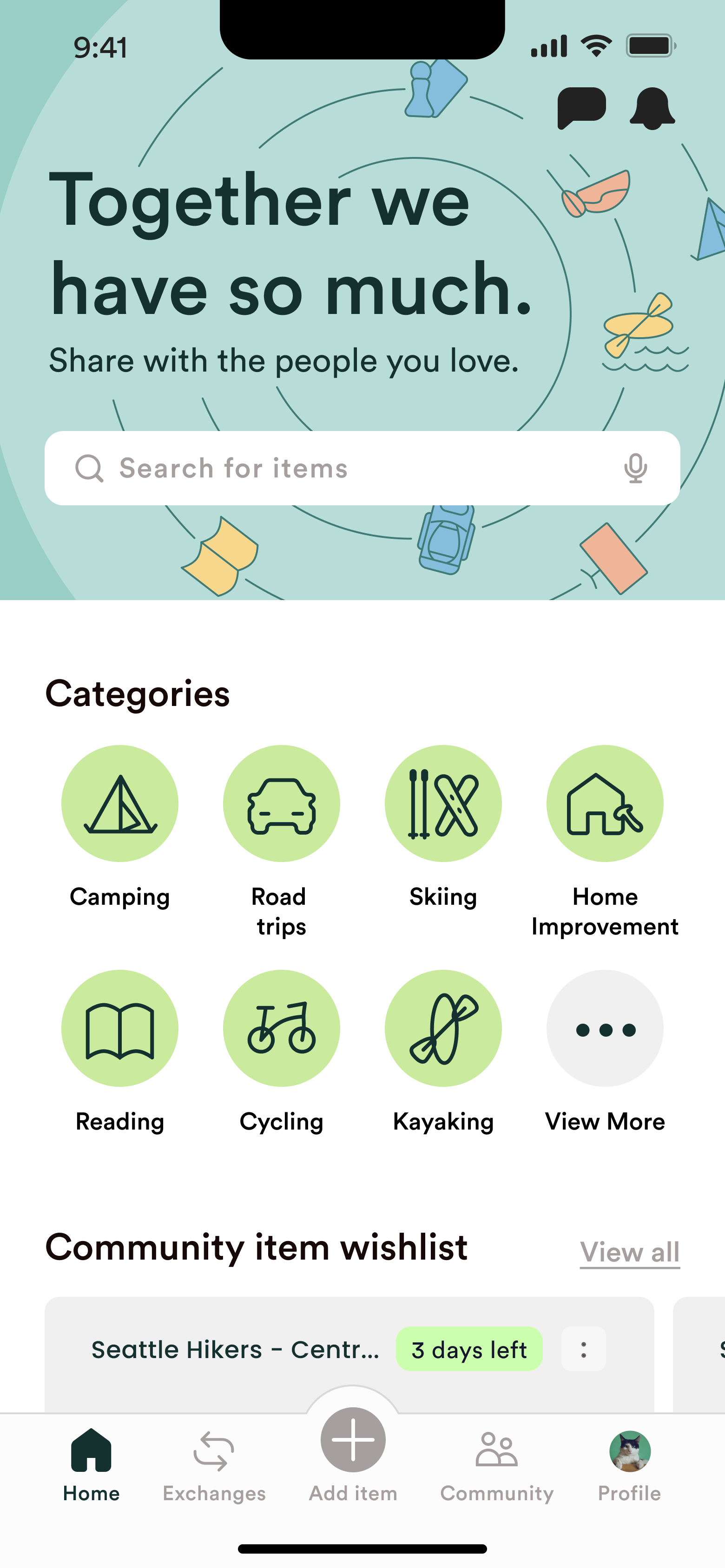
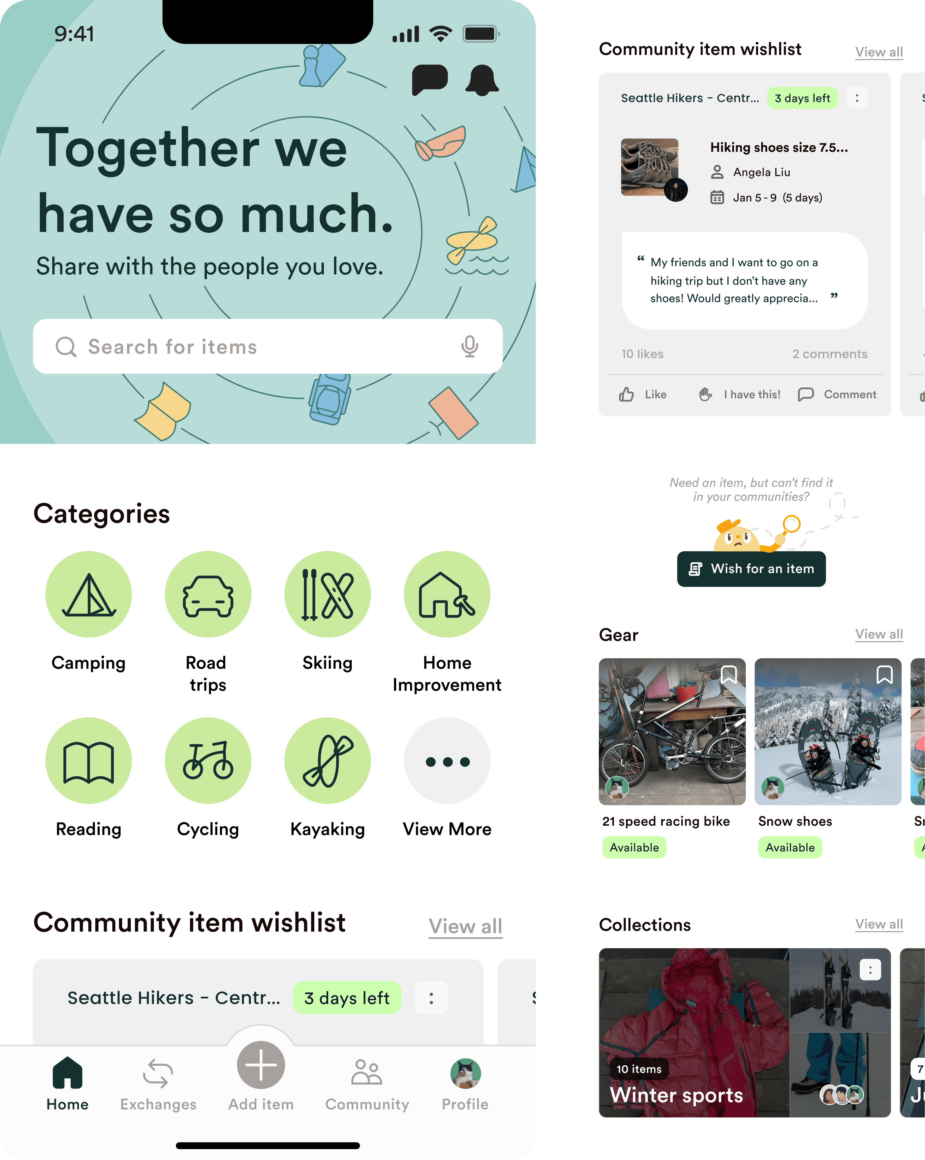
The original Home prioritized browsing existing inventory, framing it around acquiring, not contributing. We reframed it around giving — encouraging lending by leading with the community slogan and wishlist items above the fold, each tagged with item status and need-by dates. Contributor profiles on collections recognize the community's contributions.
We also reduced visual overload: the long list of categories collapsed behind a single “View More” option. The infinite scroll of items was simplified into a popular gear carousel to keep sections scannable and short.
From dead ends to next steps
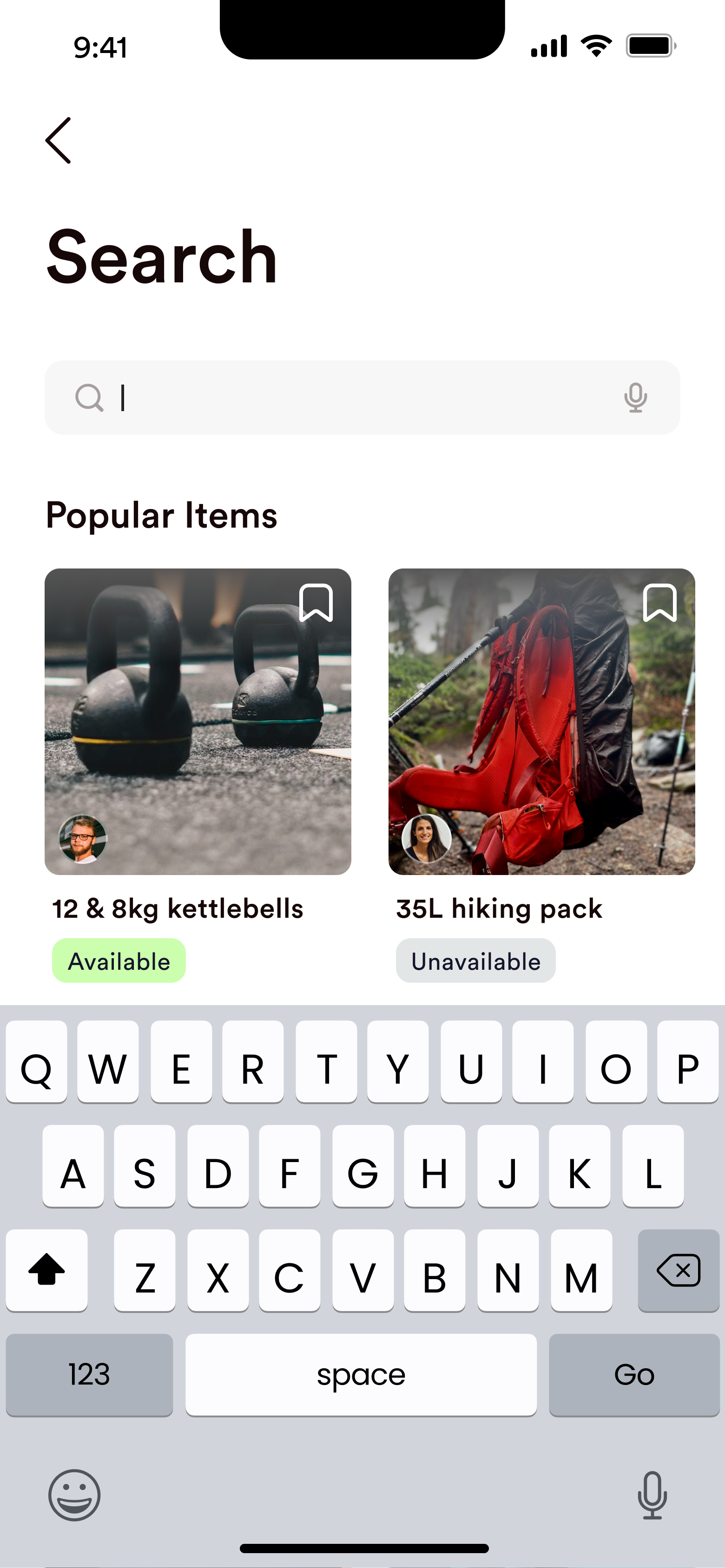
Because shared items were growing slowly across communities in the app's early stages, a search returning nothing was a likely, important scenario for reducing UX friction. I redesigned the empty state with clear hierarchy and two next steps: set an alert when a matching item is shared, or post an item wish to your communities.
In the results themselves, I made the items easier to scan: each item's availability is displayed as a result tag, information that was previously only available in a detail page.
From open posts to personal requests
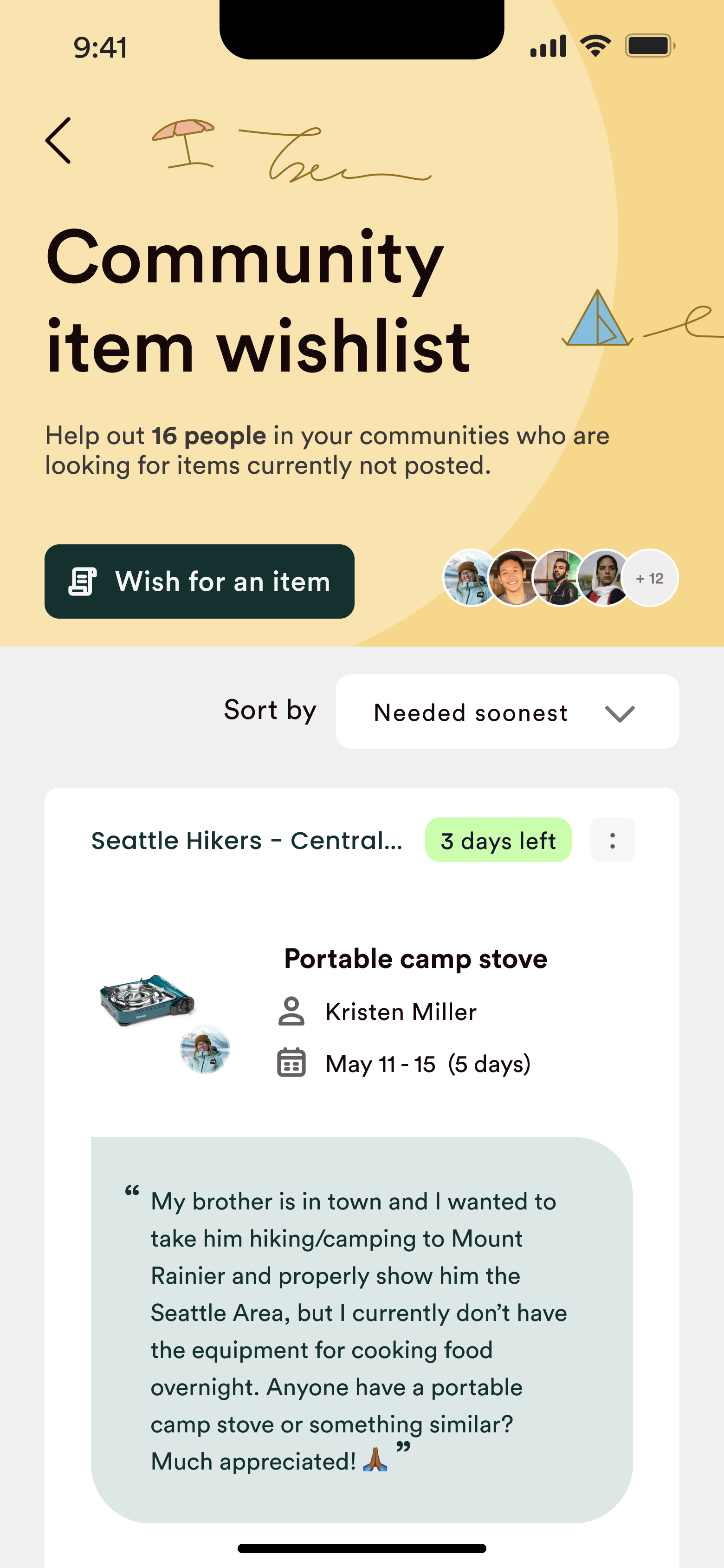
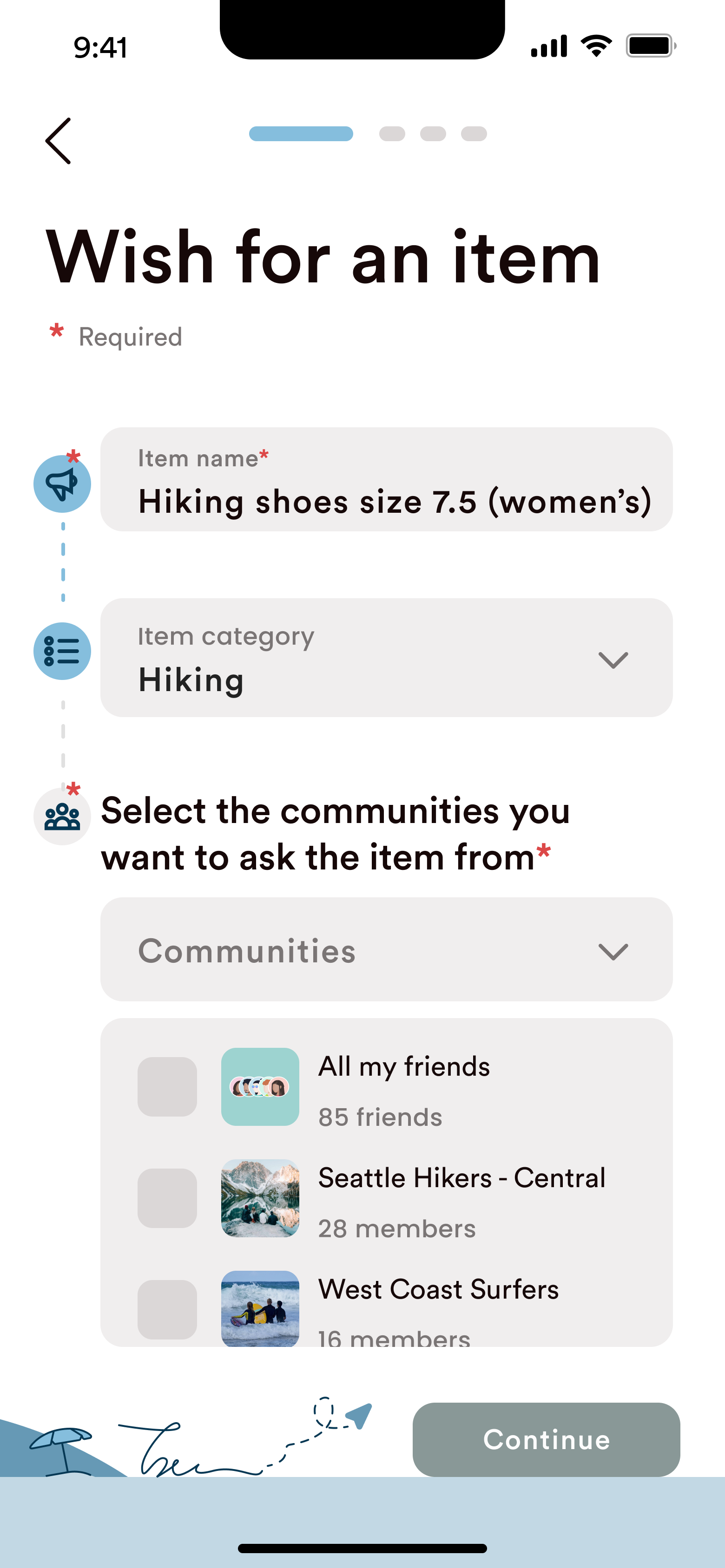
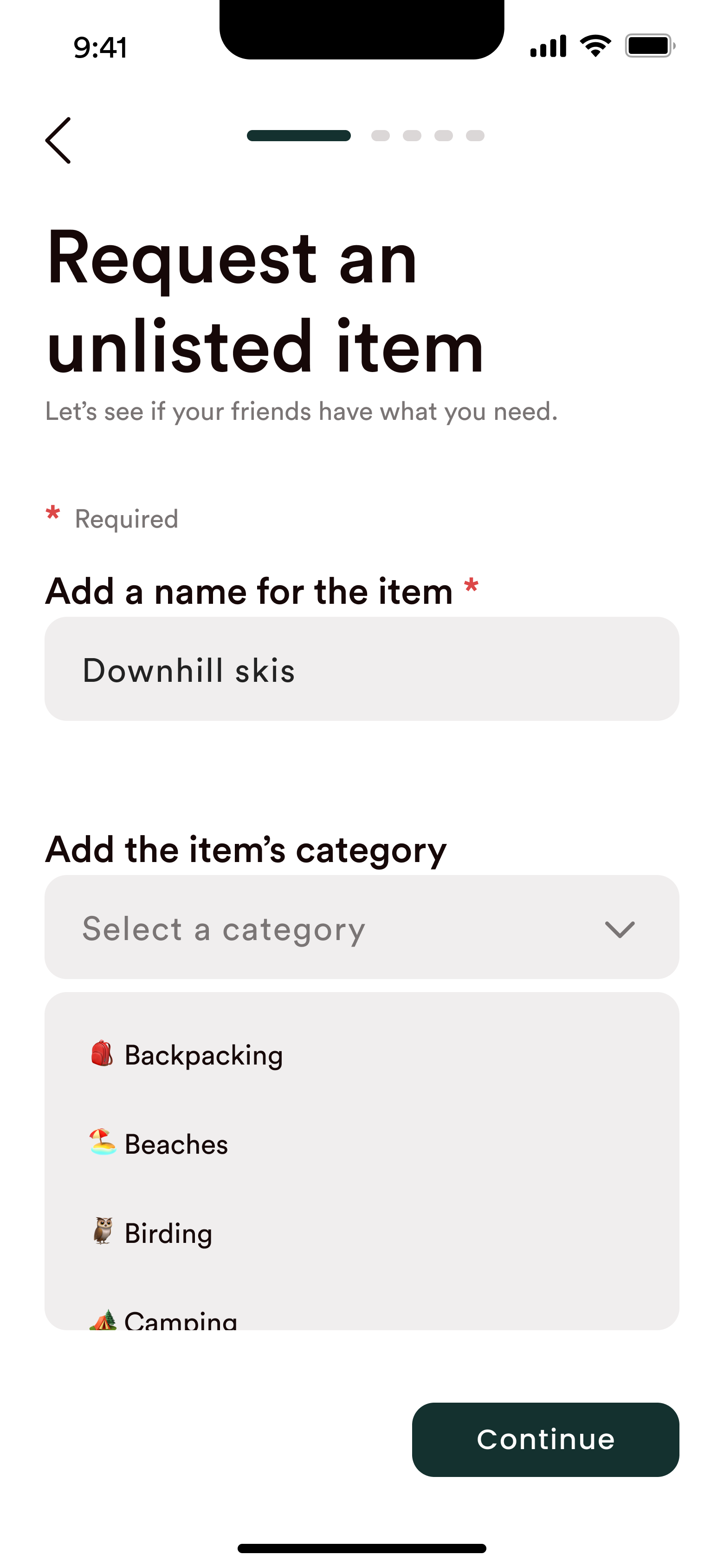
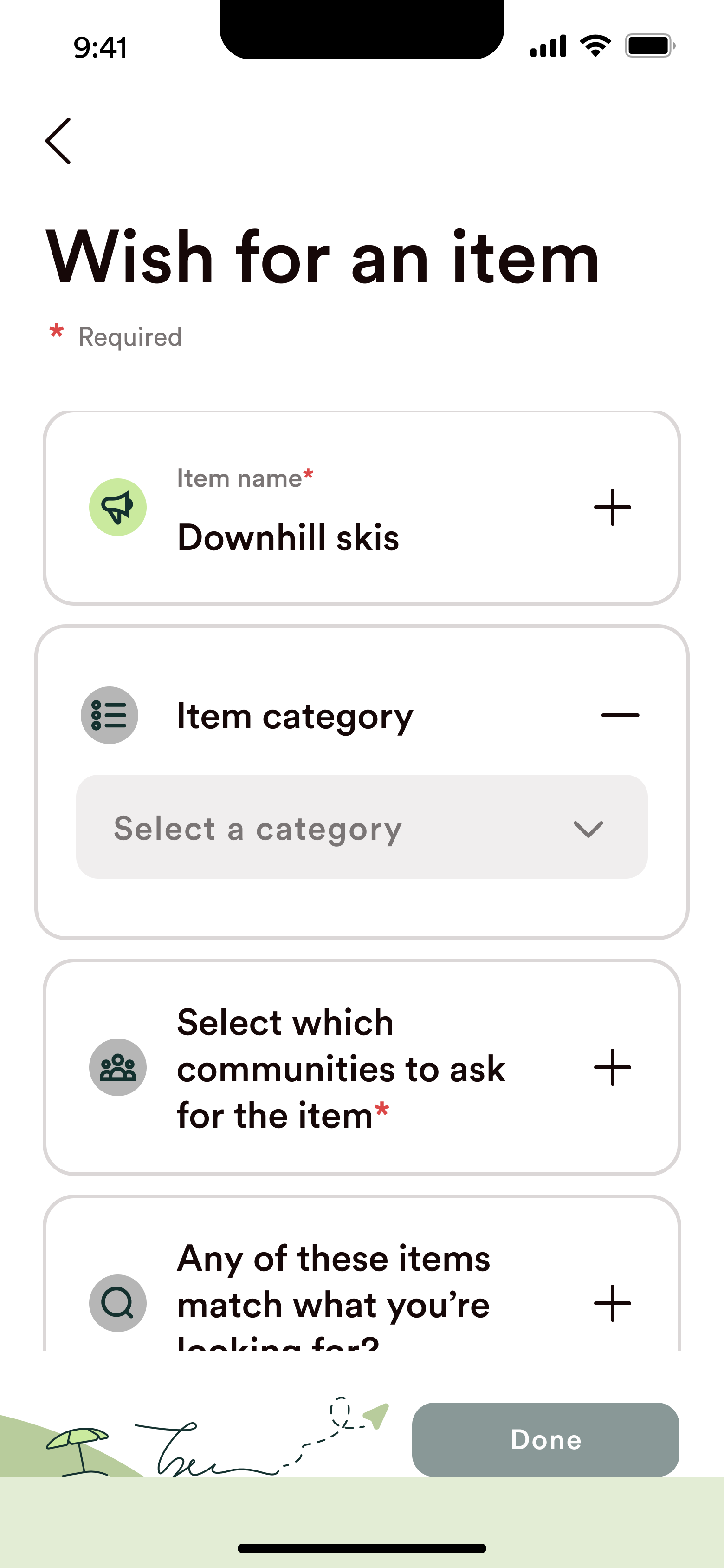
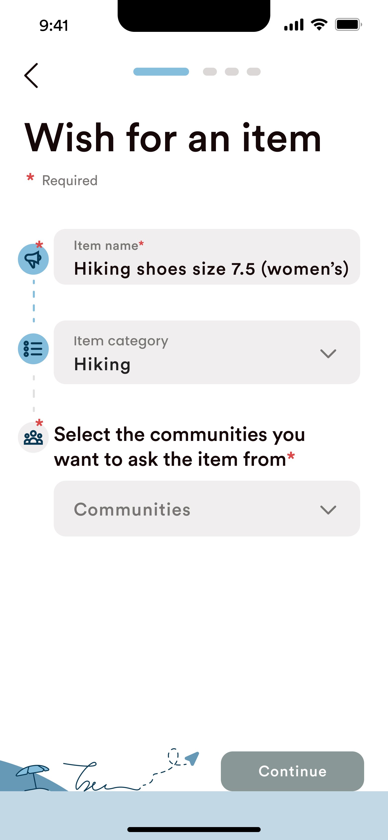
Previously, members could only write an open post to a specific community, asking if anyone had an item. I designed a guided flow prompting users to describe what they need, when, and why, to make requests more personal — grounded in our research that people are motivated to lend when they understand the need.
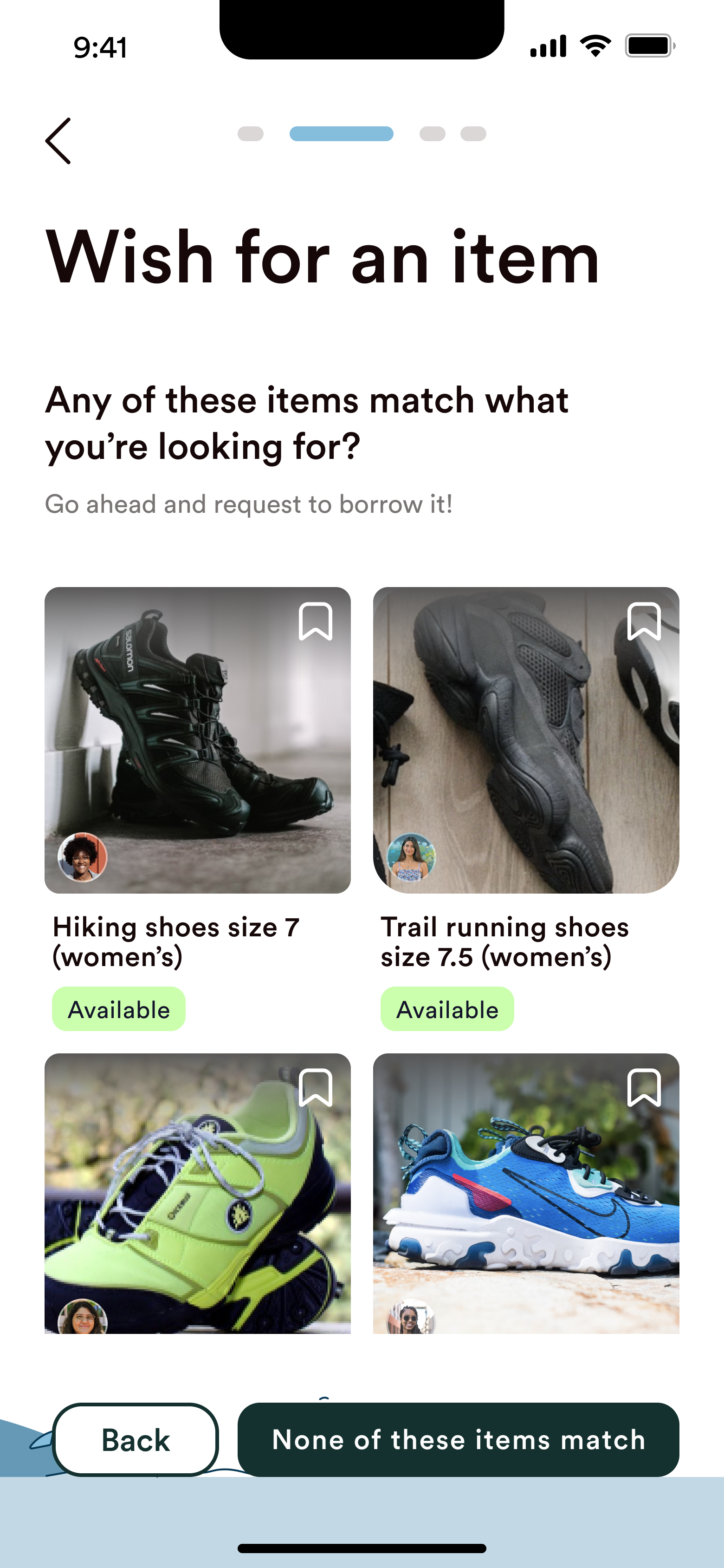
A matches checkpoint surfaces already-shared items before a user posts, to facilitate faster borrowing with fewer duplicate wishes. Borrowers can also now reach several communities at once.
Iterations of CX for creating a wish item post, including versions after usability testing with 5 participants
Conclusion
This was my first time designing for a startup — partnering directly with one of its co-founders on an early-stage product where the direction was still taking shape. What I took furthest was the craft of collaboratively pulling four designers' areas into one cohesive experience and making the team's UX rationale clear, with our design decisions being closely reviewed and aligned upon with the leadership team.
I was greatly energized by the product's potential to positively impact the environment by encouraging increased co-ownership over individual consumerism. With more time, I'd conduct additional research to further inform the design, including card-sorting to continue refining the app's information architecture, and deeper research into the question of what keeps people from sharing, and how location, socioeconomic background, and other factors shape who the experience truly serves.